Arabic laser engraving fails in a very specific way. You type بسم الله into the laser software, and what comes out is a row of disconnected letters, sometimes running left to right. Arabic needs a shaping step that most laser software never runs, so you shape the text first, turn it into vector outlines, and only then send it to the laser. Do that, respect kerf, dot size and bridges, and Arabic and Urdu engrave as cleanly as Latin text.
I learned all this building a design tool for Muzammil Laser Printing, a shop that engraves rings, pendants and metal gifts, mostly in Arabic and Urdu. The tool is free and runs in the browser. I wrote it, so weigh my opinions about it accordingly.
Why Arabic script is hard for engraving software
Cursive joining and contextual letter forms
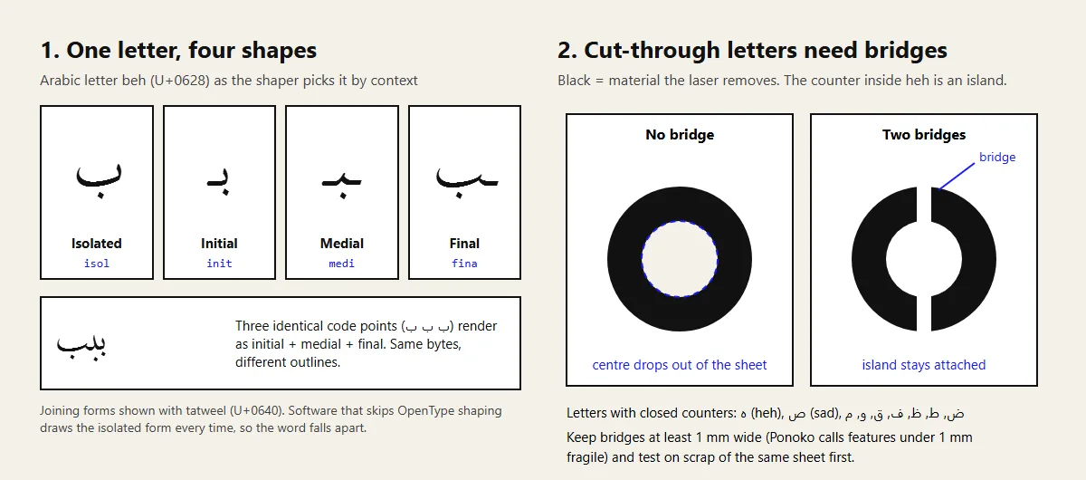
Arabic is cursive by design. The Unicode Standard's chapter on Arabic gives every letter a joining type. Dual-joining letters such as beh, teh and jeem connect on both sides and have four forms: isolated, initial, medial and final. Right-joining letters such as alef, dal and reh only connect to the letter before them, so they have two. Hamza, digits, spaces and punctuation don't join at all.
The text file stores one code point per letter: beh is U+0628 whether it starts a word or ends it. A shaping engine looks at each letter's neighbours and swaps in the right glyph from the font. Microsoft's OpenType guide for Arabic fonts lists the steps: the engine applies the isol, fina, medi and init features to pick forms, rlig for required ligatures, then curs to line up cursive connections and mark/mkmk to place diacritics.
Skip that pipeline and you get the isolated form of every letter: the broken-word result from the intro.
Ligatures you can't switch off
Some letter pairs merge into one glyph. Unicode says the lam-alef ligature is obligatory when the font supports it. Fonts also carry optional (liga) and discretionary (dlig) ligatures, which give calligraphic fonts their character. A renderer that maps characters to glyphs one by one produces none of them.
Diacritics (harakat) are tiny, and placed by the font
Vowel marks such as fatha, kasra, damma, shadda and sukun sit above or below the letters. Unicode classes them as transparent to joining, so they don't change a letter's shape, but the font decides where they go. The W3C's Arabic & Persian Layout Requirements note that every diacritic on a base letter should stay visually attached to that letter, and that placement varies from font to font. For engraving, the issue is size. A fatha, or the dots on ث and ش, can be the smallest feature in the design, and at ring scale they vanish first.
Right-to-left, with left-to-right islands
Arabic runs right to left, but numbers and Latin names inside it run left to right. Sorting that out is the Unicode Bidirectional Algorithm's job, and it isn't the shaper's. The HarfBuzz docs say plainly that HarfBuzz doesn't do bidi. You split mixed text into direction runs first and shape each run separately. A date like ١٤٤٨ هـ next to a name is exactly where engraving files go wrong.
Naskh vs Nastaliq for Urdu
Naskh is the default style for printed Arabic and most Arabic fonts. Nastaliq is different. The W3C layout document describes it as the archetypal style of the Persianate world, with a "hanging" look and flowing curves, and still the preferred style for Urdu in Pakistan. Words step down diagonally from right to left, so each word's letters sit at different heights.
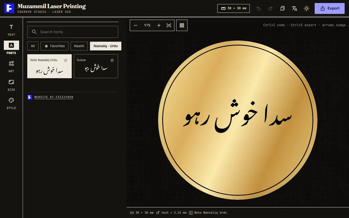
For engraving, that diagonal stacking means a long Urdu word in Nastaliq usually needs more vertical room than the same word in Naskh, and it fills a narrow ring band faster. The shaping is also heavier: Microsoft's guide illustrates the curs feature with a Nastaliq sheen-meem pair, where one glyph has to be raised so the joins meet, and simple renderers get this badly wrong. Good free Nastaliq fonts are also rare. My tool ships two, Noto Nastaliq Urdu and Gulzar.
My rule: if the customer reads Urdu, give them Nastaliq. Urdu set in Naskh is readable, but it looks foreign to them. If the space is tiny (a ring top, a 20 mm disc), show them both and let them choose, because Naskh holds up better when small.
Converting Arabic text to paths: SVG and DXF
The fix for all of the above: shape the text once in software that does it properly, then convert it to outlines, plain vector paths with no font attached. The laser software then only draws shapes and needs to know nothing about Arabic.
Browsers shape Arabic correctly, which gives a browser-based Arabic font SVG tool a head start. For export I use HarfBuzz, the open-source shaping engine that takes a font and a Unicode string and returns positioned glyphs, compiled to WebAssembly through harfbuzzjs. For each glyph it returns, the tool asks HarfBuzz for the outline and writes it into the SVG as a <path>.
Which file to export:
- SVG with outlines for LightBurn, CorelDRAW, Illustrator and Inkscape. My default.
- DXF for EZCAD and CAD workflows, common on fiber ring lasers. DXF can't carry fonts, so outlining is mandatory.
- PNG or PDF at 300, 600 or 1000 dpi for raster engraving, or when a shop asks for an image.
Before burning, click a letter on the laser PC. If the software calls it a text object, it wasn't outlined, and on a PC without that font you'll get a substitute or boxes.
Minimum sizes, stroke widths and kerf by material
Arabic text has more small features than Latin text of the same height: dots, harakat, the thin hairline of a kashida, the narrow counter inside ه or ص. Those set your minimum size, not the overall letter height.
Kerf is the width of material the beam burns away on a cut. It only matters when you cut through (stencils, cut-out names, inlays), not when you engrave a surface. Published numbers vary a lot, which is the main lesson:
| Source | Material | Kerf |
|---|---|---|
| Ponoko test, 40 W laser | Acrylic 3 mm / 6 mm | 0.125 mm / 0.140 mm |
| Ponoko test, 40 W laser | Plywood 3 mm | 0.20 mm |
| Ponoko test, 40 W laser | Hardboard 3 mm | 0.19 mm |
| Univ. of Calgary TFDL Makerspace | 3 mm Baltic birch and 3 mm acrylic | 0.075 mm |
Ponoko's kerf article notes that kerf depends on speed, power, material and thickness. The University of Calgary makerspace guide got its figure by cutting a 20 mm square that measured 19.85 mm. Run the same test on your machine; it beats any table, this one included.
For small features, Ponoko's design-quality guide calls anything under 1 mm "likely to be quite fragile", asks for at least 1 mm between cut lines, and says raster engraving gets less crisp on text and thin areas under 1 mm. For Arabic this means a dot or fatha can survive in an engraving that would never survive as a cut-out.
By material, in practical terms:
- Wood: a CO2 job, but grain and charring blur fine detail. Choose bolder fonts (Kufi or a heavier Naskh) and go easy on harakat.
- Acrylic: crisp edges and a small kerf, so it suits cut-out Arabic names. Mirror the design to engrave the back.
- Leather: also CO2. Hides vary, so test each batch and avoid hairline strokes.
- Metal: Epilog says its fiber lasers can permanently mark nearly all bare metals, while CO2 machines need a metal-marking compound. Rings are fiber territory and the place Arabic text gets smallest, often a few millimetres tall, so font choice matters most here.
Bridges for cut-out letters (stencil islands)
If you cut Arabic letters right through a sheet, every closed counter becomes a loose piece. The University of Calgary guide warns against cutting text for exactly this reason: letters like "e" and "o" lose their middles. Arabic has plenty of closed counters: ه ة ص ض ط ظ ف ق و م, plus the loops in many Nastaliq forms.
You have three ways out:
- Engrave instead of cut. No islands at all, and the usual answer for small text.
- Add bridges: small gaps in the cut path that keep each counter tied to the sheet, as in the diagram. Make them at least 1 mm wide and put them where a pen break would look natural.
- Cut letters as solid pieces and glue them to a backing board.
Arabic has one advantage here. Because letters join, a word is often one connected piece and only the dots float free, so you can bridge them to the letter or engrave them on the backing.
Font licensing for commercial engraving
If you engrave for money, the font licence matters. The good news is that the best free Arabic fonts use the SIL Open Font License 1.1. I checked the licence files in each project's repository: Amiri, Noto Naskh Arabic (part of Noto's Arabic repository) and Noto Nastaliq Urdu are all OFL 1.1.
The OFL FAQ allows commercial use and names laser-cut objects among its examples. The object you make is yours; the licence conditions apply only when you redistribute or modify the font, and you can't sell the font file by itself. Engraving a customer's ring in Amiri is fine. Selling an Amiri "font pack" is not.
Fonts that arrived in a shared WhatsApp folder are another matter. If you can't find a font's licence, keep it off paid work.
Using the Muzammil designer step by step
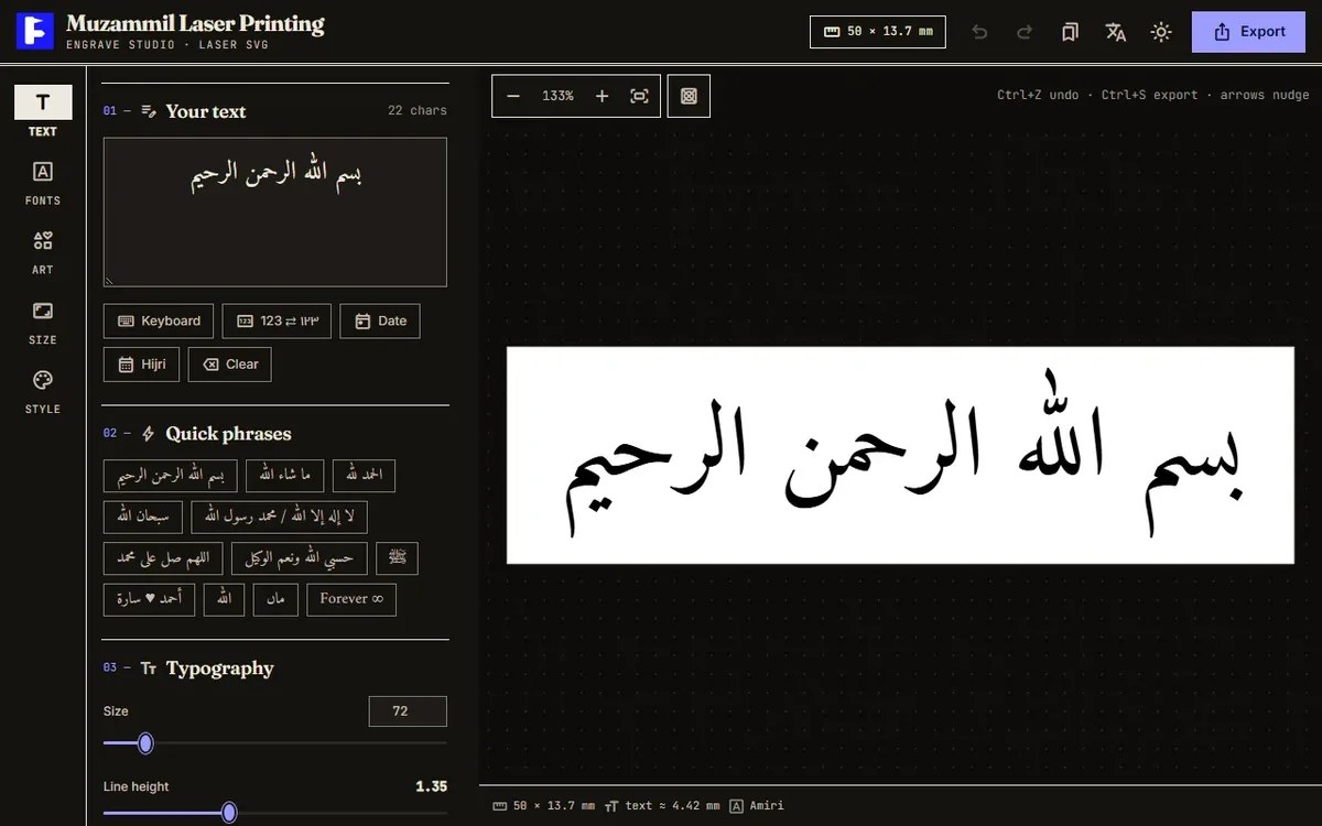
The Muzammil Laser Printing designer is a single page, with no account and no upload of your text to a server. Like my other client-side tools, it keeps your design in your browser's local storage. The interface switches between English and Arabic. Here's the workflow I set up for the shop.
1. Text
Type, or use the on-screen keyboard with Arabic, Urdu (ٹ ڈ ڑ ں ے), harakat and symbol rows. Buttons swap 123 for ١٢٣ and insert today's date or the Hijri date (Umm al-Qura calendar). Twelve quick phrases cover common orders, from Bismillah to ماں. You can drag the text on the canvas.
The letter-spacing slider carries a warning: spacing breaks Arabic joining, so stretch words with tatweel (ـ) instead. The W3C document agrees that pushing joined letters apart gives bad results.
2. Fonts
There are 36 open-source Arabic fonts in six groups: Naskh (Amiri, Scheherazade New, Lateef, Noto Naskh Arabic, Markazi Text, Mirza), Nastaliq for Urdu (Noto Nastaliq Urdu, Gulzar), Kufi, Modern, Script (Aref Ruqaa, Ruwudu, Qahiri) and Display. Each card previews your own text, which is the only preview that counts. There's search, favourites and a recently used list.
3. Art
A small library of original single-line motifs (floral, love, faith, nature, ornament) drawn to stay clean in laser software, plus logo upload as SVG, PNG, JPG or WebP up to 4 MB. Each piece can be resized, moved, rotated, flipped and duplicated. Prefer SVG or a flat PNG over a JPG logo; my image format guide explains why.
4. Size
This tab is where the tool stops being a generic SVG editor. Auto mode takes an output width in mm and lets the height follow the text. Custom takes any width and height. Product mode has ten presets, from a 16 × 12 mm ring top and a 20 mm disc to a 40 × 8 mm bar necklace and an A6 plaque.
Ring mode takes a US, EU or inner-diameter size, the band width, and inside or outside engraving (plus band thickness for outside), then gives the circumference and flat engraving area for a rotary or flat-band jig. US size 7 works out to a 17.32 mm inner diameter and about 54.4 mm around. Curved text puts words on an arc, with an option to send the last line to the opposite arc for seal layouts: name on top, date below.
5. Style
Output defaults to "Laser · black". Fill can be solid, outline (single-line paths for scoring) or both. Material swatches such as gold, steel, wood and acrylic are preview only; the export stays plain black vector. Keep background on "None" or the rectangle gets engraved too. A mirror switch handles the back of glass, acrylic or stamps. Throughout, the status bar warns when text is under 1 mm tall, past the safe margin, longer than its arc, or outlined too thickly for its size.
6. Export
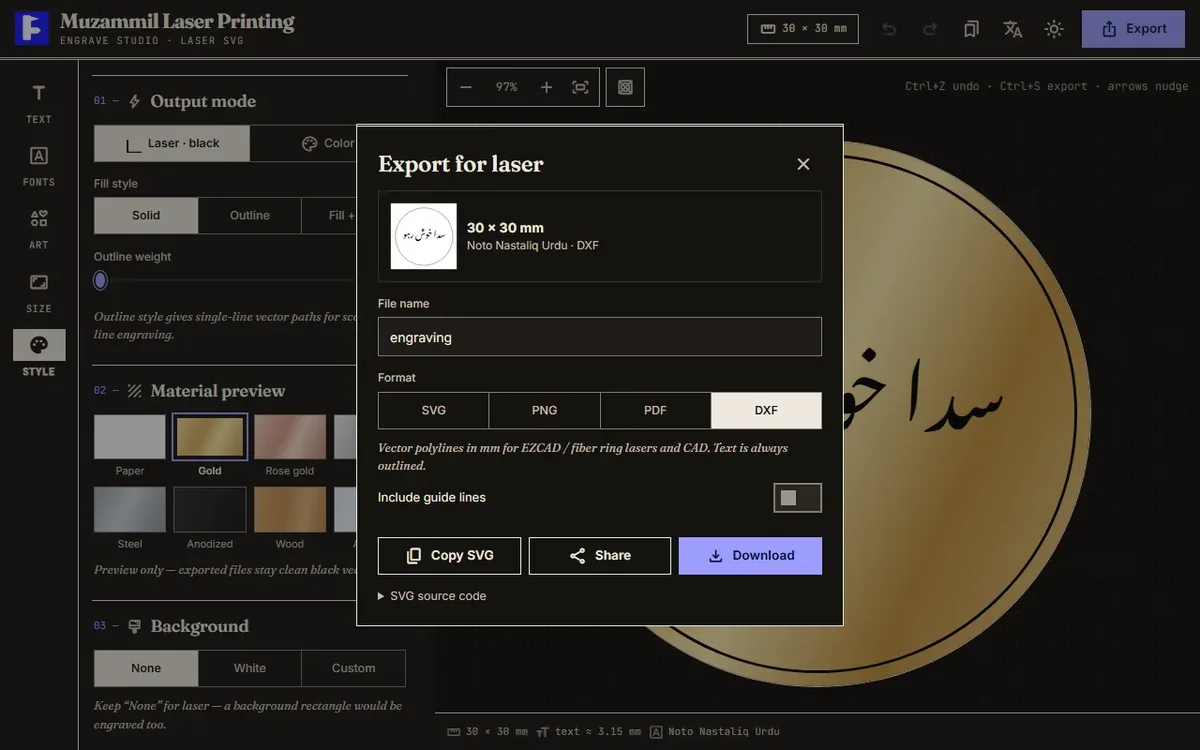
Press Export or Ctrl+S. For SVG, "Convert text to outlines" is on by default; leave it. For DXF, the tool samples every path about every 0.04 mm using the browser's geometry functions and writes R12 polylines in millimetres on a layer called ENGRAVE. Images and emoji can't go into DXF, and it tells you when it drops them. PNG exports carry their real DPI, so LightBurn imports them at true size. "Saved designs" keeps named designs to reload later.
Pre-flight checklist for Arabic laser files
- A native reader has checked the joins, lam-alef and the direction of any date or name.
- The font licence allows commercial use.
- All text is outlines (click it on the laser PC).
- Dots and harakat are above your tested minimum; treat 1 mm as a warning line.
- No letter spacing, no background rectangle, mirror only when engraving from behind.
- For cut-through work: kerf measured, counters bridged, 1 mm between cut lines.
- Size checked in mm against the real object, then one test burn on scrap.
What building it taught me
On-screen rendering was easy because the browser handles Arabic. Export took the work: live-text SVG looks perfect in Chrome and breaks on a laser PC without the font. So the tool loads HarfBuzz for outlines, converts WOFF font files to plain OpenType so HarfBuzz can read them, and falls back to a Latin font for English mixed into Arabic.
The bidi handling is a deliberate shortcut. It splits each line into right-to-left and left-to-right runs, treats numbers as left-to-right, and gives neutral characters the direction around them. That covers the names, dates and phrases a jewellery counter sees, though it isn't the full Unicode Bidirectional Algorithm and long mixed paragraphs could trip it up. For an engraving tool I think that's the right trade.
For shops, the next headache is how customers send files, which is why I also built PrintDrop, a phone-to-counter file drop. If you want a tool like this for your own shop, see my services page.
FAQ
Why does my Arabic text come out as separate letters in LightBurn or CorelDRAW?
The program, or the copy-paste route into it, skipped OpenType shaping, so every letter is drawn in its isolated form and often left to right. Shape the text somewhere that does it properly (a browser, or a tool that uses HarfBuzz), convert it to outlines there, and import the outlines instead of live text.
What is the smallest Arabic text I can laser engrave?
It depends on the machine and material, so test it. As a starting point, Ponoko treats features under 1 mm as fragile, and Arabic dots and harakat are the smallest features in the word. My tool warns when the main letter body drops under about 1 mm tall.
Can I use free Arabic fonts like Amiri for engraving I sell?
Amiri, Noto Naskh Arabic and Noto Nastaliq Urdu are released under the SIL Open Font License 1.1. The OFL FAQ says you can use OFL fonts for commercial products such as signs and laser-cut objects, and the object you make is yours. What you cannot do is sell the font file on its own.
Should I use SVG or DXF for Arabic laser engraving?
Use SVG with text converted to outlines for LightBurn, CorelDRAW and Illustrator. Use DXF when the laser software is EZCAD or CAD-based, which is common on fiber ring lasers. Either way the text must be outlines, not live text.
Further reading
This tool came out of work for a print and engraving shop. The other half of that job was getting customer files onto the shop PC safely, which I wrote up in sending files to a print shop without WhatsApp or USB.
Sources
- The Unicode Standard 18.0, Chapter 9: West Asia-I (Arabic, cursive joining)
- W3C: Arabic & Persian Layout Requirements (Group Draft Note)
- Microsoft: Developing OpenType Fonts for Arabic Script
- HarfBuzz manual: What is HarfBuzz? and What HarfBuzz doesn't do
- harfbuzzjs (HarfBuzz compiled to WebAssembly)
- Ponoko: Figuring out kerf for precision parts
- Ponoko: How do I design for highest quality?
- University of Calgary TFDL Makerspace: Designing for the laser
- Epilog Laser: Can Epilog lasers engrave metal?
- SIL Open Font License FAQ
- Amiri licence file (OFL 1.1)
- Noto Nastaliq Urdu repository and Noto Arabic repository (OFL 1.1)